Skate Box Redesign
Project Tasks
Art Direction, Strategy Boards, Design, Illustration, Photo Art Direction, Photo Retouching
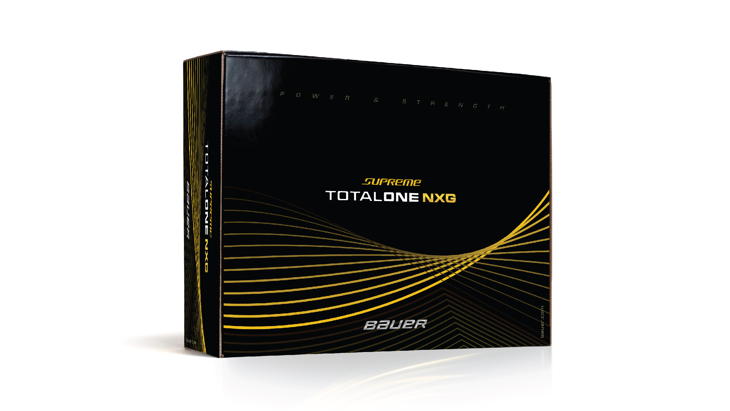
BAUER® is the strongest, most recognized and premium brand in all of hockey, yet they had the same two color box for all their skates. They asked for help solving this problem in an exciting and unique manner, helping both consumers and retailers find the correct skate. My designs offered two distinct ways of solving the problem. The first design is about honoring the game. The sheet of ice, skate marked and imperfect, is authentic and iconic. The second design is about better performance through technology. Bright colors contrasted against a black master brand color, creates a dramatic, easily shop-able experience.