Mini Meatballs Redesign
Project Tasks
Design, Photo Art Direction, Photo Retouching
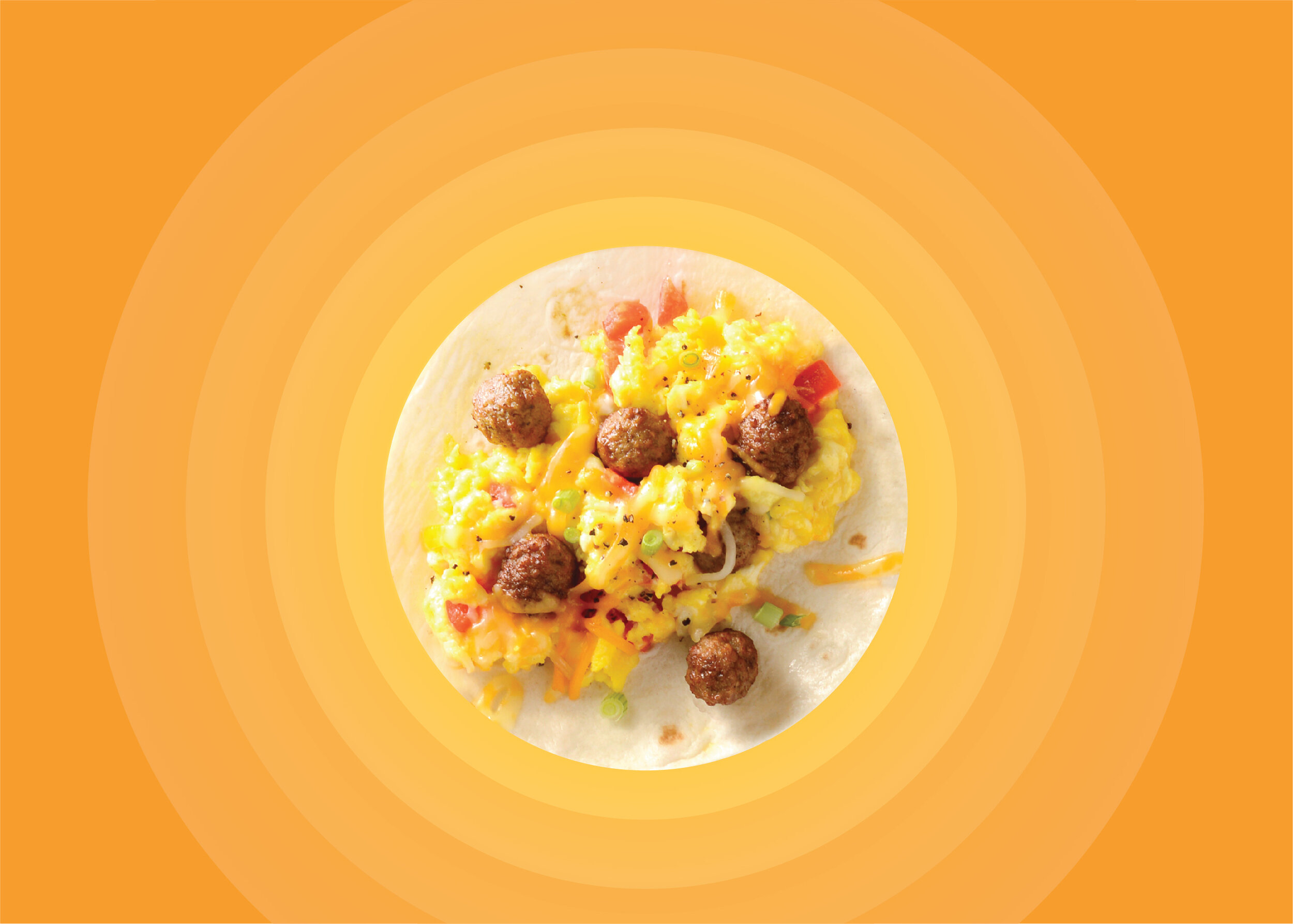
The client wanted a fun, kid-friendly, but not kid focused design. They wanted to inspire product usage with photography, maintain their current color system and unmistakingly communicate Beef and Turkey. My bullseye design used a large top down photograph to anchor and inspire the viewer. The typography and background rings add elements of fun. My second design is a meatball free-for-all. Graphic illustrated forks reaching for beautifully photographed meatballs from all sides of the package is unexpected and fun


